Around a month ago my Tunnelbear stopped working. For those not in the know, my exotic pet did not down tools or anything. Tunnelbear is actually the name of a VPN. A ‘Virtual Private Network’, aka those programs that hackers in films use to bounce their signal around the world so they can’t be traced. While I never did anything that interesting with mine, it proved it’s worth when I ventured outside and used potentially dangerous public Wi-fi.
Looking back, I have to admit that a certain part of my reason to choose Tunnelbear was because of it’s branding. Yes, it garnered lots of positive reviews from journalists and data security experts alike, but if I’m being really honest with myself I just really liked the cute bear. The little messages when you’re installing were also cute.
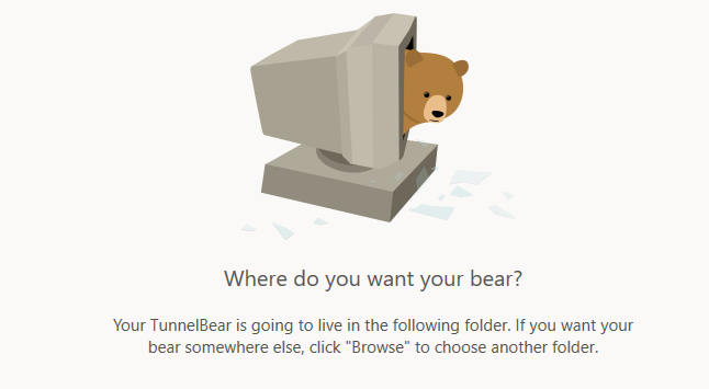
Instead of ‘Where do you want to install this software?’ it’s:
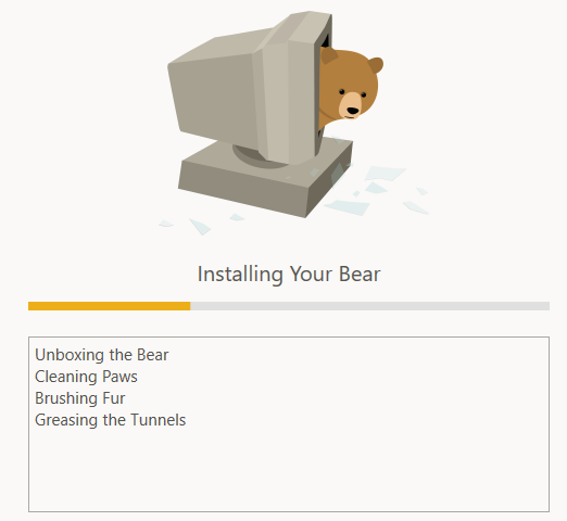
And instead of the usual indecipherable gubbins about the progress of the installation, you get:
I think we can all agree this is very cute, and A Good Thing. However, this quaint tone can get grating after a while. Especially if your app no longer does what you want it to do.
After booting up Tunnelbear one day, I noticed that the connection simply wouldn’t connect to where I specified. Changing this target did nothing, as did messing around with the other settings offered. So, defeated, I ventured over to the Support section of their website. After looking through the somewhat meagre support pages, and grimacing slightly at the suggestion that 'your tunnelbear might need a helping ‘paw’, I fired off an email to their support staff. Or, sorry, their support ‘bears.'
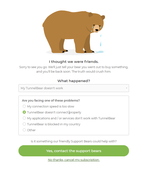
Sadly, there was no response. After the second attempt also fell on deaf ears I made The Final Step: cancelling my subscription. Which is where the charm offensive of Tunnelbear started to feel offensively patronising:
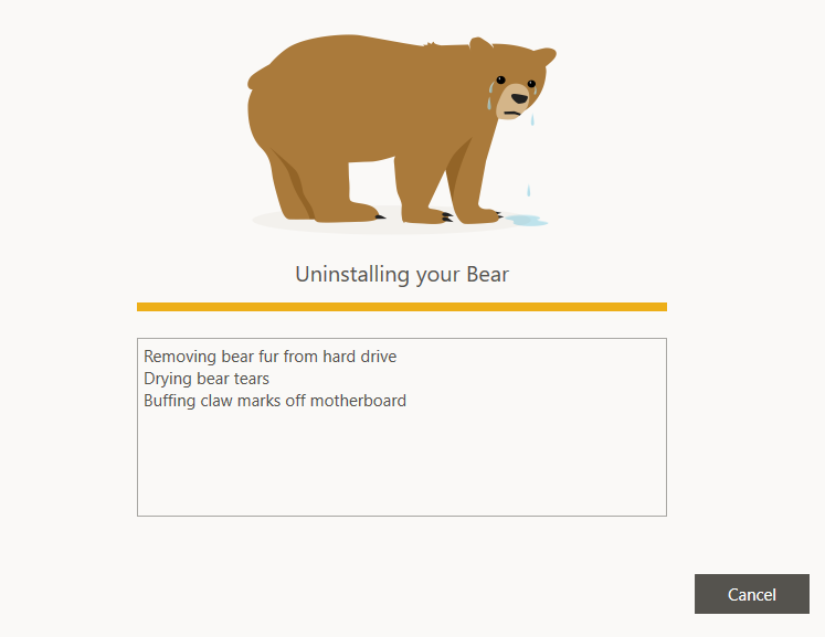
The uninstall gubbins also left much to be desired:
To me, it’s clear that once a user starts to reconsider their purchase, all masquerading as a happy-go-lucky, cheeky-chappy company needs to stop. This is my real money were talking about here, please don’t belittle my purchase. Especially if this is compounded by support with the product and / or lacklustre customer support. The tone of writing like this, in this situation, can come off as a class clown who won’t admit they’ve gone a step too far. It also removes any good word of mouth from me going forwards, as the overpowering bitterness of the situation dwarfes any fond reminiscence of the 'VPN With the Cute Bear.'
To change this, the writing needs to take on a more formal tone. One that thanks the user for coming along for the ride so far, and that should anything change they’d be always welcome back. Confidence is always sexy and a ‘thank you for your time, have a good evening’ comes across leagues better than ‘oh, I wasn’t good enough…? No ever loves me. Everyone leaves me eventually…’
To change it to more confident, sexier tone I’d go for something like:
- Ready to return above ground?
- The underground life not for you?
- You bring a shovel?
- Reading to start tunnelling on your own?
- Looking for a new guide?
- Having a tidy up
- Cleaning off paw marks
- Researching surface world
- Drawing map in case you get lost
- Filling in tunnel entrance
These phrases acknowledge that users choice and ultimately accepts it. No pouting, no guilt-tripping. The writing equivalent of a firm handshake and a friendly invitation back if they'd like one. No need to just grin and 'bear' it! Or get 'grizzly' with the customer!